


4 Unique Ethereum Price Charts That Indicate Upcoming Selloffs
Ethereum’s native token, Ether (ETH), has seen a strong rebound, nearly doubling in value since its April low of around $1,385. While the surface-level price action appears stable, new on-chain data from Binance paints a more cautious picture, signaling growing downside pressure.

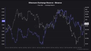
Rising Exchange Reserves Signal Caution
According to on-chain analyst BorisVest, who shared insights via CryptoQuant, several key metrics suggest that a wave of distribution may be underway—and even point to potential capitulation risk ahead.
One of the most notable red flags is the sharp increase in ETH reserves on Binance. Since December, reserves have risen from approximately 3.78 million ETH to over 4.21 million ETH—a seven-month high.
This sustained inflow typically signals selling intent, as investors move tokens onto exchanges when preparing to liquidate. In contrast, when sentiment is bullish, traders often withdraw ETH for long-term holding or staking.
Market Sentiment Tilts Bearish
The current pattern suggests that many traders are using the recent price rally to take profits rather than position for further gains. This behavior indicates skepticism about a breakout above the key $2,700 resistance level.
Rather than signaling confidence in continued upside, the rising reserves highlight that investors may be bracing for a pullback. The timing—ETH flowing into exchanges just as the price nears local highs—underscores a lack of conviction in the market’s ability to maintain momentum.
Massive Ethereum Netflows Signal Distribution
This negative shift is further supported by the exchange netflow chart.
In just three trading sessions, Binance has received over 346,000 ETH in net inflows. This happened just as ETH was trying to go back toward the top of its current range.
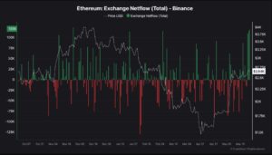
The difference between ETH deposits and withdrawals from an exchange is measured by netflow. Negative levels indicate accumulation, whereas positive values show net deposits, which are usually linked to greater selling pressure.
A lack of notable price follow-through combined with these sizable daily inflows suggests that whales took advantage of the recent rebound as a departure. The fact that there was no upward continuation supports the idea that there was not enough demand to meet supply.
What Does It Mean When the Exchange Supply Ratio Rises with the Price of Ethereum?
During the recent surge, the Ethereum Exchange Supply Ratio, which measures the portion of ETH’s total supply held on Binance, also increased. The ratio rose from near-yearly lows in March to 0.034 by the end of May.
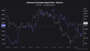
The bearish picture is further layered by this indicator. There could be more sell pressure shortly if more supply moves onto markets. It indicates that sellers are becoming more active than buyers when this ratio rises as the price moves higher or consolidates.
A phase of coordinated distribution is strongly implied when a rising supply ratio is in line with growing reserves and net inflows. Stability may be seen as strength by bulls, but the underlying data show otherwise.
The Taker Buy/Sell Ratio Suggests the Absorption of Ethereum
Lastly, a crucial aspect is shown by the Taker Buy/Sell Ratio: although ETH experienced vigorous market purchasing during its most recent rally, it was unable to create momentum. On a number of days in late May, the ratio surged above 1.0, indicating that buyers were starting to place trades at the going rate.
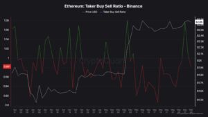
Such taker activity is typically positive since it shows buyers’ hurry and conviction. On the other hand, it indicates that sellers are exploiting the demand as exit liquidity when a spike in market purchases does not result in a higher price.
Essentially, institutional traders and whales sold into the rally’s false sense of strength. A breakdown is usually preceded by this absorption of buying power without upside follow-through, especially when it is supported by increasing exchange reserves and netflows.
Ethereum Price Prediction
Ethereum has formed a clear inverse head-and-shoulders pattern on the daily chart, pointing to a potential breakout toward $4,150 if the neckline at $2,700 is breached. The structure, coupled with a recent golden cross, suggests bullish momentum could build—if confirmed.
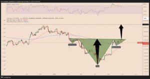
ETH continues to face rejection near the neckline, and volume remains weak. The relative strength index (RSI) is correcting after breaching the overbought threshold of 70. At 56, it shows room for further downside.
A decisive close above $2,700 is needed to validate the breakout. Failure to do so risks a drop toward $2,300 or lower, invalidating the bullish setup.
Ethereum Price Forecast on Weekly Chart Indicates ~60% Crash Next
Near $2,530, Ethereum is testing a major resistance confluence that is made up of the 0.382 Fib level, the top edge of a descending wedge, and a flipped multi-year ascending trendline. ETH hasn’t been able to rise beyond this zone yet.
The 50-week EMA around $2,575, which ETH hasn’t closed above convincingly, is another source of pressure. As a result, the overall trend remains pessimistic.
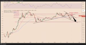
Should this confluence be rejected, there may be a prolonged down toward the 0.0 Fib level around $1,075 and a decline to the wedge’s lower border around $1,975. Unless ETH recovers $2,575 with significant volume, there is still a considerable chance of a crash.
Disclaimer and Risk Warning
coinweck does not endorse or is responsible for any content, accuracy, quality, advertising, products, or other materials on this page. The image used in this article is for informational purposes only and is provided to us by a third party. coinweck should not be held responsible for image copyright issues. Contact us if you have any issues or concerns. Readers should do their research before taking any actions related to the company.